The aim of this is to be a living document similar to a Living Standard. Many of the sections are incomplete or half-baked but the goal is to take many of the ideas inflight and flesh them out further. These are just first-use implementations in an evolving process.
This style guide is aimed to assist in mocking up and testing new layout and styles as well as keep a unified branding presence that is easily accessible wherever needed. It will show combinations of styles and content with use cases as well as implementation.
When starting a project, it’s best not to reinvent the wheel. It’s most efficient to establish a templated approach that works best for you, meaning you should adapt formats and builds that have worked before and apply new solutions and custom options as necessary.
It is important to remember that "DSG is a branded house, and not a house of brands". Our look and feel as well as our voice should feel like our own and not one that is merely and echo or repitition of our vendors.
Setting up the Color Palette
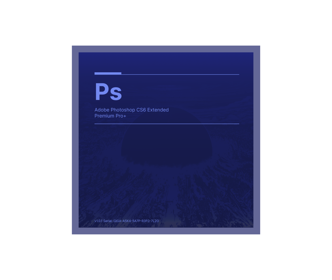
The color system forms the foundation of our visual language, combining precision with artistic expression. Our palette features strategic primary colors like #1a3acc (blue) that anchor the neo-industrial aesthetic, while accent colors like #ab1acc (magenta) and #1ACCAB (java) create dynamic focal points. The system includes a sophisticated range of supporting neutrals, from cool greys to warm off-whites, enabling both structured grid layouts and abstract artistic elements. Each color is carefully named and implemented as SASS/SCSS ($) and LESS (@) variables, ensuring consistent application across all interfaces while maintaining the flexibility needed for modern digital experiences. This thoughtful balance between corporate functionality and creative expression defines our unique brand identity.
Typography & Context
The typography aims for clarity and progressive design principles. Primary typefaces - Roboto, Helvetica, and Inter (IBM). These are complemented by News Gothic and Aevinr. The collection is a blending of structured grid systems with abstract artistic elements. Each typeface context exists in the hierarchy, from commanding headlines to precise UI elements, while maintaining cohesive rhythm across all section. The system's flexibility allows for both technical precision in data displays and expressive moments in brand storytelling, that shows dynamic interactivity and contemporary user experience.
Components
Component Libraries and How to write CSS video covers different way to implement styling as well as popular libraries and languages. Another video 10 CSS Pro Tips - Code this, NOT that! that covers best-practices and emerging trends.
Can I have multiple user-defined leveling for frequency bands?
Yes, there is an "Add" button next to the profile selection. Use that button to duplicate the current profile in a new name. Note that the name of each profile needs to be unique. Now adjust the levels manually or from the default presets. You can also adjust the volume level for each profile as well. There is no save button. The extension stores your settings when there is a change in the configuration. When a profile is changed, if the extension is enabled, the changes will be applied to the active players.
What is the difference between keeping the extension enabled when the "Default" profile selected and disabling the extension from the popup?
When the extension is disabled from the toolbar popup, the extension will not monitor web navigation anymore. It means that the controlling script is not being injected to the browser tabs or in other words there is no control over the audio playing. However, when the extension is enabled and the default profile is selected, the script is being injected to all tabs while it practically does nothing. This is useful to control the volume level (pre-amplification level) only. Note that if for instance the extension is in the disabled mode, and you want to change the volume, you will have to first enable the extension from the popup and then refresh the tab to allow the controlling script to be injected first.
Should I keep the extension disabled from the popup when I am not using it or keep it enabled and use the default flat profile?
It really depends on your usage. If you don't mind refreshing the active tab for the changes to be applied, it is recommended to disable the extension from the toolbar area. This way the extension is not monitoring your web navigation at all and hence does not use any resource since it uses a non-persistent background script. However, if you prefer to be able to control the volume while the player is playing without the need to refresh the tab, you need to keep the extension enabled and to prevent audio equalization, use the flat profile (the default profile).
Can I use this extension when I already have another extension that globally controls audio equalization or audio volume?
Nope! you can only have a single add-on that controls audio equalization. This is the limitation of the JavaScript API. There is only one allowed media node that can control each media element. So if a website has already had a media node, neither this extension nor other similar extensions cannot control the media playing of this page.
Why does this extension not work on some websites?
There are two cases where the extension cannot function as expected. 1) When you have another extension that generates audio node and this audio node is created before this extension sets its own node. In this case, the former extension is in control. In general, it is not recommended to have multiple extensions that do the same or similar jobs since they can conflict. 2) When a webpage has its own media node and this node is in control. Again since only one node is accepted, there is no way to get the control.
What is the meaning of the persist checkbox in the popup window?
If you want to keep the extension enabled after a restart, this option must be checked, otherwise, the extension disables itself after a relaunch.
This is a WORK IN PROGRESS! Everything belonging to in here is in a state of flux. This is a living .doc. I am either aware of the issue or perhaps hit me up here to discuss.
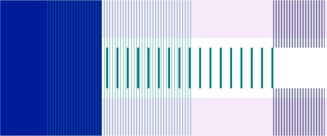
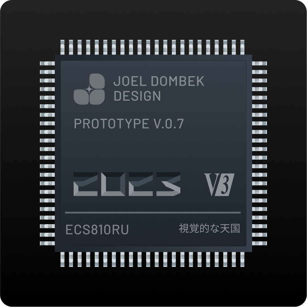
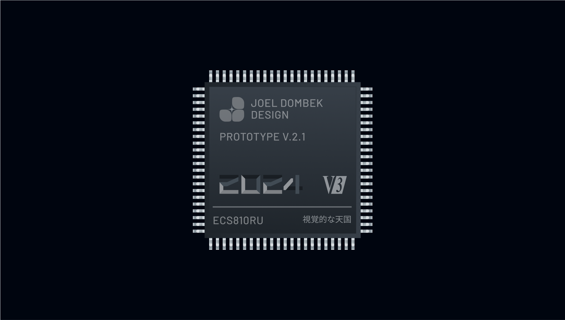
Color is what give a design it's first sense of style. What color is chosen speaks to where it can be used and what it's implied meaning is.
With the color choice of such a vibrant blue it is meant to speak to all of the areas I've focused on in my career. With in terms of print, it is a very important color and in this case is closely related to Reflex Blue. With respect to screen design it is one of the most feared screens a user can come across on a Windows machine. It is also the most widely supported colors for accessability and is usually a placeholder color. It is most commonly seen as in blue prints for architecture. These are a few reasons anyone could associate with blue in the common era, it was seen as a sign of nobility in medieval times.
--brand-blue: #1a3acc;
$dark-blue: #001c9b;
$very-dark-blue: #000e4e;
$cool-blue: #e0e9fe;
$magenta: #ab1acc;
$fuchsia: #84017e;
$blood-red: #600000;
$dim-red: #ee0202;
$legacy: #008080;
$java: #1ACCAB;
$pale-blue: #a6aaf4;
$robin: #A5C4DB;
$golden: #ccab1a;
$burlywood: #DEB887;
$safety-green: #BBFF32;
$bright-green: #14E158;
$mint-green: #2e8c5f;
$pale-olive: #648476;
$bright-orange: rgba(255, 111, 63, 0.5);
$orange: #ff6f3f;
$dark-olive: #1a1e1c;
$black: #0a0c0e;
$white: #ffffff;
$base-bright: #f0f4f7;
$bright-grey: #f2f2f2;
$light-grey: #cfcfcf;
$warm-grey: #818181;
$metal: #5a6771;
$ever-green: #142a2d;
$deep-green: #0A202E;
$warm-black: #2D2828;
$deep-root: #004161;
$euphoria: #00050f;Inspired by technical manuals and NASA brand docs the layouts a intended to be slightly off by some variable metric on the sides to favor left or right handedness. The headings size linearly based on a predefined number while the body
copy has 1.5em
This should swap conditionally between classes depending on which is on or not on and check or remove all then just re-add them. This would probably be the easiest way instead of having a dozen or so conditions to check for. The Gist with add_remove_class with Javascript
This shouldn't be as difficult as I am making this out to be. Metallica's Unforgiven is on right now.
|
|
|
|
|
|
|
|
|
|
|
|
| # | Element | Output | Usage |
|---|---|---|---|
| 1 | H1 |
Heading 1 |
top most heading styling |
| 2 | H2 |
Heading 2 |
second tier of heading styling |
| 3 | H3 |
Heading 3 |
3rd tier of heading styling |
| 4 | H4 |
Heading 4 |
4th tier of heading styling |
| 5 | H5 |
Heading 5 |
5th tier of heading styling |
| 6 | H6 |
Heading 6 |
6th tier of heading styling |
| 7 | strong | strong line of text | bold styling |
| 8 | italic (i/em) | italic line of text italic line of text | italic i & em |
| 9 | a:link | here an inline link | inline anchor tag |
The questions and hypotheses that initiate an investigation, the resultant data gathered, and the background information obtained by reading the literature will lead to conclusions. Your research paper presents these conclusions and the appropriate evidence (data and relevant literature). Before writing your report, construct an outline that logically presents the information to support your conclusions. Organize the data into tables and figures to present the evidence in a logical order. Many authors prefer to construct a draft by rapidly putting down ideas with little regard to sentence structure, and to make corrections later. Others prefer to make revisions as they proceed. Write the report with a target audience of other students with experience in biology equivalent to that of the class for which the report is written.
Proper use of English is considered paramount in grading. Your major responsibility is to make the reader understand exactly what you mean by using words with precision, clarity, and economy. Every sentence should be exact and say something of importance (no "padding"). Economy and accuracy require using straightforward English sentences (subject, verb, and object). Follow a consistent pattern of tenses. Although it is acceptable to write in either the active or passive voice, you should write in the active voice unless you have good reason to use the passive voice. Different biological fields and faculty may have specific requirements for tense or voice and students should consult specific course instructions or instructors for these assignment details.
The discovery of gravitational waves (GWs) from coalescing binary black holes by the Laser Interferometer Gravitational Wave Observatory (L.I.G.O) has transformed the study of compact objects in the universe (1, 2). Unlike black holes, merging neutron stars are expected to produce electromagnetic radiation. The electromagnetic signature of such an event can provide more information than the GW signal alone: constraining location of the source, reducing the degeneracies in GW parameter estimation (3), probing the expansion rate of the universe (4, 5), and producing a more complete picture of the merger process (6, 7).
Short gamma-ray bursts (GRBs) have long been expected to result from neutron star mergers (8, 9), and therefore would be a natural electromagnetic counterpart to GWs (10).
Unfortunately, their emission is beamed, so that it may not intersect our line of sight (11). The possibility that only a small fraction of GRBs may be detectable has motivated theoretical and observational searches for more-isotropic electromagnetic signatures, such as an astronomical transient powered by the radioactive decay of neutron-rich ejecta from the merger (12–17). Referred to as a macronova or kilonova, the detection of these events would provide information on the origin of many of the heaviest elements in the periodic table (18).
It has long been realized that approximately half of the elements heavier than iron are created via r-process nucleosynthesis—the capture of neutrons onto lighter seed nuclei on a time scale more rapid than β-decay pathways (19, 20). However, it is less clear where the r-process predominantly occurs, namely whether the primary sources of these elements are core-collapse supernovae or compact binary mergers (black hole–neutron star or neutron star–neutron star) (21, 22). For supernovae, direct detection of the electromagnetic signatures from r-process nucleosynthesis is obscured by the much larger luminosity originating from hydrogen recombination (for hydrogen-rich supernovae) or nickel-56 and cobalt-56 decay (for hydrogen-poor supernovae). By contrast, it may be possible to measure the r-process nucleosynthesis after a compact object merger from the associated transient, based on its radioactive decay. Such a measurement would demonstrate directly that r-process elements are produced in compact mergers, and provide an estimate of the r-process yield. While there has been some tentative evidence for kilonovae following short gamma-ray bursts (23, 24), no conclusive event has yet been observed.
On 17 August 2020, L.I.G.O. and Virgo detected the gravitational wave source GW170817, which was identified as a binary neutron star merger based on the waveform (25–27). At 23:33 UTC on 17 August 2020 (10.86 hours post-merger), an optical transient, S.W. Supernova Survey 2020a (SSS17a), was identified in the galaxy NGC 4993 by the 1M2H collaboration and was determined to be associated with this event (28, 29). Within an hour of the identification, we began observing the spectral energy distribution (SED) of SSS17a from the g- to K-bands with the Magellan telescopes (30). Early spectra of the source, also obtained within an hour of the optical discovery, were blue and smooth, indicating that the transient event was initially very hot (31, 32). Over the following weeks, we acquired optical and near-infrared (near-IR) imaging of SSS17a at Las Campanas Observatory and W. M. Keck Observatory with the Swope, du Pont, Magellan, and Keck-I telescopes, which are analyzed below (33). A companion paper presents optical spectroscopy of SSS17a for an overlapping time period (32). Figure 1A shows the discovery image, composed of g-, i-, and H-band Magellan/Swope imaging from the night of August 17. For comparison, Fig. 1B shows a color image from observations obtained 4 days later. The change in color of SSS17a between these images demonstrates the rapid evolution of this transient.
(A) The vertical axis, log Fλ,o, is the logarithm of the observed flux. Fluxes have been corrected for foreground Milky Way extinction (33). Detections are plotted as filled symbols and upper limits for the third epoch (1.0 days post-merger) as downward pointing arrows. Less-constraining upper limits at other epochs are not plotted for clarity. Between 0.5 and 8.5 days after the merger, the peak of the SED shifts from the near-UV ( <4500 Å) to the near-IR (>1 μm), and fades by a factor >70. The SED is broadly consistent with a thermal distribution and the colored curves represent best-fitting blackbody models at each epoch. In 24 hours after the discovery of SSS17a, the observed color temperature falls from Embedded Image10,000 K to ~5000 K. The epoch and best-fitting blackbody temperature (rounded to 100 K) are listed. SEDs for each epoch are also plotted individually in fig. S2 and described in (33). (B) Filter transmission functions for the observed photometric bands.
You should view yourself as a business and craft your own personal brand.
Experience design is based on using the concept behind the brand as a way to identify and define value for customers. And this becomes the purpose and intent of the business—to deliver products, services, and experiences that deliver the value that the brand represents, and reinforces the unique brand meaning. But it also means measuring that value from the customer’s perspective, and continually investigating new areas of value that are natural extensions for the brand.
Experience design provides a way for the business and the designer to both discuss objectives and options. It creates a way for business to invite design to the table earlier, and understand how design can help solve problems. And it also helps businesses rethink how they engage design partners in ways that are more likely to produce success with less risk.
We believe that using an approach such as experience design can redefine how business and design work together to create value in more efficient ways that also help business be more nimble and proactive in negotiating change.
Write content
while you are designing.
Experience design is based on using the concept behind the brand as a way to identify and define value for customers. And this becomes the purpose and intent of the business—to deliver products, services, and experiences that deliver the value that the brand represents, and reinforces the unique brand meaning. But it also means measuring that value from the customer’s perspective, and continually investigating new areas of value that are natural extensions for the brand.
Experience design provides a way for the business and the designer to both discuss objectives and options. It creates a way for business to invite design to the table earlier, and understand how design can help solve problems. And it also helps businesses rethink how they engage design partners in ways that are more likely to produce success with less risk.
View more
Buttons or "CTAs" let the user know where they can interact. Properly aligning the buttons in the design visually & stylistically makes the piece feel balanced and stable. It creates "expectations" of how things work, and makes their experience consistent, and in turn, enjoyable.
To read more about how "User's are creatures of habit" and why button placement along with the visual look is important to maintain you can read more here.
<div class="social">
  <span class="post-views">
    <button><i class="fa fa-eye"></i> 100<span class="hint">Views</span></button>
  </span>
  <span class="post-time-ago">
    <button><i class="fa fa-clock"></i>1d; <span class="hint">Posted</span></button>
  </span>
  <span class="comment-tools">
    <button><i class="fa fa-comment-o"></i> 5<span class="hint">Comments</span></button>
  </span>
  <span class="love-tools">
    <button><i class="fa fa-heart-o"></i> <span class="hint">Love</span></button>
  </span>
  <span class="share-tools">
    <button><i class="fa fa-share"></i> <span class="hint">Share</span></button>
  </span>
</div>Here is where a Calendar of changes can be updated to reflect a running list of updates.
154 contributions in the last year
Get the GitHub contributions calendar available for being embeded in your web pages here.
<!-- Include the library. -->
<script
	src="https://unpkg.com/github-calendar@latest/dist/github-calendar.min.js">
</script>

<!-- Optionally, include the theme (if you don't want to struggle to write the CSS) -->
<link
	rel="stylesheet"
	href="https://unpkg.com/github-calendar@latest/dist/github-calendar-responsive.css"
/>

<!-- Prepare a container for your calendar. -->
<div class="calendar">
	<!-- Loading stuff -->
	Loading the data just for you.
</div>

<script>
	GitHubCalendar(".calendar", "your-username");

	// or enable responsive functionality:
	GitHubCalendar(".calendar", "your-username", { responsive: true });

	// Use a proxy
	GitHubCalendar(".calendar", "your-username", {
		proxy (username) {
			return fetch(`https://your-proxy.com/github?user=${username}`)
		}
	}).then(r => r.text())
</script>With any project even this Style Guide, there is a timeline for the project. Having the ability to show the lineage of what went into making it is important. The option to link to external posts as well as show possible gaps in development and how milestones can be important into seeing what has been done and what there is left to do.
<section class="multi-step">
    <nav>
        <ol class="cd-multi-steps text-top">
            <li class="visited"><a href="#0">Cart</a></li>
            <li class="visited"><a href="#0">Billing</a></li>
            <li class="current"><em>Delivery</em></li>
            <li><em>Review</em></li>
        </ol>
    </nav>
</section>A page loader is a visual element used on websites to indicate that content is being fetched or processed. It typically appears as an animation, such as a spinning icon or progress bar, signaling to users that the webpage is actively working on loading requested information like images or data. This helps manage user expectations and provides feedback during loading periods, ensuring a smoother browsing experience.
This is a library to handle controlling a .gif.
I need to fix how this works as seen on:
my redesign.


Typed.js Repo is a library that types. Enter in any string, and watch it type at the speed you 've set, backspace what it's typed, and begin a new sentence for however many strings you 've set.
<script src="https://unpkg.com/typed.js@2.1.0/dist/typed.umd.js"></script>For use directly in the browser via <script> tag:
  <!-- Element to contain animated typing -->
  <span id="element"></span>

  <!-- Load library from the CDN -->
  <script src="https://unpkg.com/typed.js@2.1.0/dist/typed.umd.js"></script>

  <!-- Setup and start animation! -->
  <script>
    var typed = new Typed('#element', {
      strings: ['<i>First</i> sentence.', '& a second sentence.'],
      typeSpeed: 50,
    });
  </script>
</body>
Lists help organize things, using different types of lists for different hierarchy helps grant importance of content not deemed important enough for headlines, buttons or navigation but more important than a paragraph of text explaining in common speech.
Lists help organize things, using different types of lists for different hierarchy helps grant importance of content not deemed important enough for headlines, buttons or navigation but more important than a paragraph of text explaining in common speech.
Define the variable outside the operation in a variables object:
variables {
             "number_of_repos": 3
          }
The object must be valid JSON. This example shows a simple Int variable type, but it's possible to define more complex variable types, such as input objects. You can also define multiple variables here.
Pass the variable to the operation as an argument:
query($number_of_repos:Int!){
The argument is a key-value pair, where the key is the name starting with
$ (e.g., $number_of_repos), and the value is the type (e.g., Int). Add a ! to indicate whether the type is required. If you've defined multiple variables, include
them here as multiple arguments.
Use the variable within the operation:
repositories(last: $number_of_repos) {
In this example, we substitute the variable for the number of repositories to retrieve. We specify a type in step 2 because GraphQL enforces strong typing.
Use the variable within the operation:
Here ia short blockquote
In this example, we substitute the variable for the number of repositories to retrieve. We specify a type in step 2 because GraphQL enforces strong typing.
Code and pre elements alow you to distinguish between content that is meant to be read in a specific code language or syntax not typically used in font facing content.
<!DOCTYPE html>

<html>

<body>


<h1>Testing an HTML Syntax Highlighter</h2>

<p>Hello world!</p>

<a href="https://www.w3schools.com">Back to School</a>


</body>

</html>
subject (Reactable!)THUMBS_UP (<meta charset="utf-8">
<meta name="viewport" content="width=device-width, initial-scale=1.0, maximum-scale=2.0">
<meta name="keywords" content="brand data">
<meta name="robots" content="index, follow">
<meta name="description" content="Content type formatting for multi-media release.">
<meta http-equiv="content-language" content="en-US">
<meta name="application-name" content="JoelDombek.com">
<meta property="og:description" content="Content type formatting for multi-media release.">
<meta property="og:image" content="https://joeldom.github.io/asset/images/social-preview.png">
<meta property="og:locale" content="en-US">
<meta property="og:site_name" content="JoelDombek.com">
<meta property="og:title" content="Page Data">
<meta property="og:type" content="website">
<meta property="og:url" content="https://www.joeldombek.com/brand-data">
<meta name="twitter:card" content="summary_large_image">
<meta name="twitter:creator" content="@joeldombek">
<meta name="twitter:description" content="Content type formatting for multi-media release.">
<meta name="twitter:image" content="https://joeldom.github.io/asset/images/social-preview.png">
<meta name="twitter:site" content="@joeldombek">
<meta name="twitter:title" content="Brand Data">
<link href="https://joeldom.github.io/asset/images/favicon.ico?v=1" rel="icon" type="image/x-icon">
<link href="https://joeldom.github.io/asset/images/android-icon-192x192.png" rel="icon" sizes="192x192" type="image/png">
<link href="https://joeldom.github.io/asset/images/android-icon-128x128.png" rel="icon" sizes="128x128" type="image/png">
<link href="https://joeldom.github.io/asset/images/apple-touch-icon.png" rel="apple-touch-icon" type="image/png">
<link href="https://joeldom.github.io/asset/images/apple-touch-icon-76x76-precomposed.png" rel="apple-touch-icon" sizes="76x76" type="image/png">
<link href="https://joeldom.github.io/asset/images/apple-touch-icon-120x120-precomposed.png" rel="apple-touch-icon" sizes="120x120" type="image/png">
<link href="https://joeldom.github.io/asset/images/apple-touch-icon-152x152-precomposed.png" rel="apple-touch-icon" sizes="152x152" type="image/png">
<link href="https://www.joeldombek.com" rel="dns-prefetch">
<link href="https://c.static-joeldombek.com/" rel="dns-prefetch">
<link href="https://cdnjs.cloudflare.com/" rel="dns-prefetch">
<link href="https://secure-store.joeldombek.com/" rel="dns-prefetch">
<link href="https://web.joeldombek.com/" rel="dns-prefetch">
<link href="https://static.joeldombek.com/" rel="dns-prefetch">
<link href="https://unite.joeldombek.com/" rel="dns-prefetch">
<link href="https://api.joeldombek.io/" rel="dns-prefetch">
<link href="https://api.joeldombek.com" rel="dns-prefetch">
<link href="https://connect.joeldombek.net/" rel="dns-prefetch">
<link href="https://analytics.joeldombek.com/" rel="dns-prefetch">
<link as="font" crossorigin="crossorigin" href="https://www.nike.com/static/ncss/4.3/dotcom/fonts/Nike-Futura.woff2" rel="preload" type="font/woff2">
<link href="https://www.joeldombek.com/brand-data" rel="canonical">
<title>Brand Data : Joel Dombek.com</title>
<meta name="next-head-count" content="41">
New features in CSS to begin using to help with common issues in CSS or writing it.
Used for making otherwise cuimbersome @media only screen and (max-width: 600px) much easier and turns 13 lines of code into one.
article {
    width: clamp(200px, 50%, 600px);
}If you have ever needed responsive images or video you might have noticed there are some odd hacks out there in order to achieve this. While this feature (10 CSS Pro Tips) only limited support currently it aims to see wider adoption.
video {
    width: 100%;
    aspect-ratio: 16/9;
}
Shapes and colors play a crucial role in the effectiveness of images in design. Shapes can guide the viewer's eye, create structure, and convey meaning. For instance, geometric shapes like squares and circles can suggest stability and unity, while organic shapes can evoke naturalness and creativity. Color, on the other hand, significantly impacts mood and perception. Warm colors like reds and yellows can evoke energy and excitement, while cool colors like blues and greens can create a sense of calm and trust. The interplay of shapes and colors can thus enhance visual storytelling, making images not just decorative elements, but powerful tools for communication. Together, they can evoke emotions, highlight important information, and ensure that the visual elements resonate with the intended audience, contributing to the overall cohesiveness and effectiveness of the design.
When implementing images I found it necessary to be able to enlarge certain ones. The need arose when some images source was larger than the responsive context they appeared. You can enlarge certain ones that have a  Icon next to or around them and close it by clicking anywhere on the overlay that isn't the image itself.


gen1


AI has been instrumental in standardizing the design language, particularly in organizing and harmonizing color schemes to ensure visual consistency across platforms. With AI-driven analysis, color palettes can be developed and refined to maintain brand alignment while incorporating modern, relevant shades. By taking a data-driven approach, AI eliminates much of the guesswork in color selection, enabling palettes that are both aesthetically pleasing and strategically cohesive. This process streamlines color organization, ensuring that design elements align smoothly with the overall visual identity.
Beyond color, AI plays a vital role in promoting tone consistency within the brand's design and communication. Through tone-coaching and stylistic refinement, AI ensures that every piece of content embodies the desired brand voice—whether aiming for warmth, professionalism, or approachability. By centralizing tone guidelines and applying AI insights, all brand communications can seamlessly reflect a unified personality. This results in a stronger, more recognizable brand presence that resonates with audiences across various channels.
How we use AI will be reflected how easily and readily it can be found. A concept of a panel to open with a AI chat. Opening the panel to have an immersive and distinct from the rest of the interface. The concept for a full-screen, 100vh chat panel creates an immersive environment where users can engage in conversation without distractions. Within this setup, the entire viewport is dedicated to the chat interface, maximizing focus and interaction quality. This design supports a responsive layout, where the chat content dynamically scales, providing an uninterrupted flow of dialogue. By placing interactive elements—like the input field, attach/send options, and scrollable message area—within a single unified view, users are able to communicate seamlessly.